

Learning Management System (D2L) Redesign Case Study
In this project, we identified what design changes the D2L website needs by looking at it from both the student and professor perspectives, since it’s the main platform MSU students and professors use. At first, we evaluated the current D2L interface for students and instructors using Nielsen Norman heuristics. Then we, conducted in-person user interviews and affinity mapping to uncover key UX pain points. Finally we, designed low to high-fidelity screens for prototyping, including a mood board and style guide, to simplify navigation and user interface.
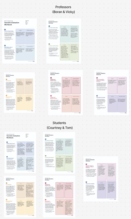
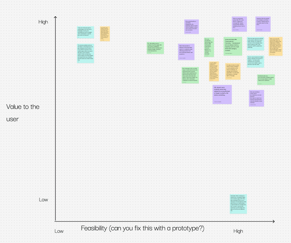
The first step in this process was getting into our groups and completing a Heuristic Evaluation of the current website. We did this by splitting up our group of 4 into 2 groups of 2, 2 in charge of students and the other 2 in charge of professors. We then used the Nielsen Norman Groups “Heuristic Evaluation Workbook” to complete the evaluation.
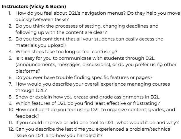
Once we had the 10 questions answered on the Heuristic Evaluations for the students and professors, we made them into sticky notes and put them into a priority matrix.
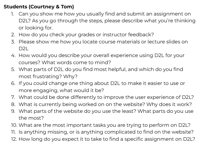
Once this was done the next thing we needed to do to refine D2L is to conduct interviews to figure out the problems with the current website based on others experiences with D2L. We split this up into 2 groups, the students and professors. Each group member was in charge of getting 2 interviews, so the total number of interviews was 8. The next part of this process was creating the questions for the students and professors interviews.
The next step was to complete the interviews. Every group member decided to do their interviews in person, and we each decided to take notes ourselves. Once all the interviews were completed, the next step was to create sticky notes from the notes each of us had from the interviews. Then we reconvened as a group to find themes among the data and label those themes and put each sticky note within a theme. Next, we grouped the notes within the themes that share similar characteristics.
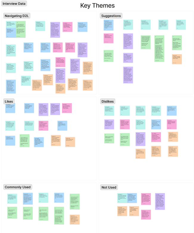
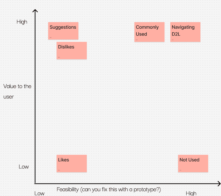
We then created another priority matrix based on the main themes we created to sort our data.
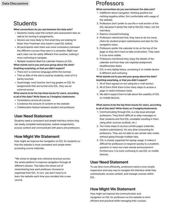
Once we completed this, the next step was to answer some questions about the data we collected. We did this within our groups of 2, and for both the students and professors.
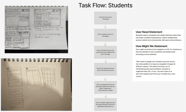
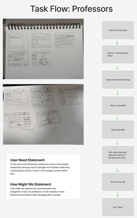
During the low-fi phase, our group split into two teams: two of us focused on students, while the other two worked on professors. Using our user needs statements and “How Might We” prompts, we created quick sketches and task flows to map out how each user group would move through the system.
For students, we explored ways to simplify navigating assignments, checking deadlines, and communicating with professors. For professors, our sketches centered on managing multiple courses, uploading materials efficiently, and responding to student questions without unnecessary steps.
By comparing both sets of workflows side-by-side, we were able to identify pain points early and create a clearer foundation for our mid-fi designs.
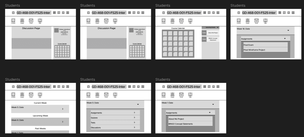
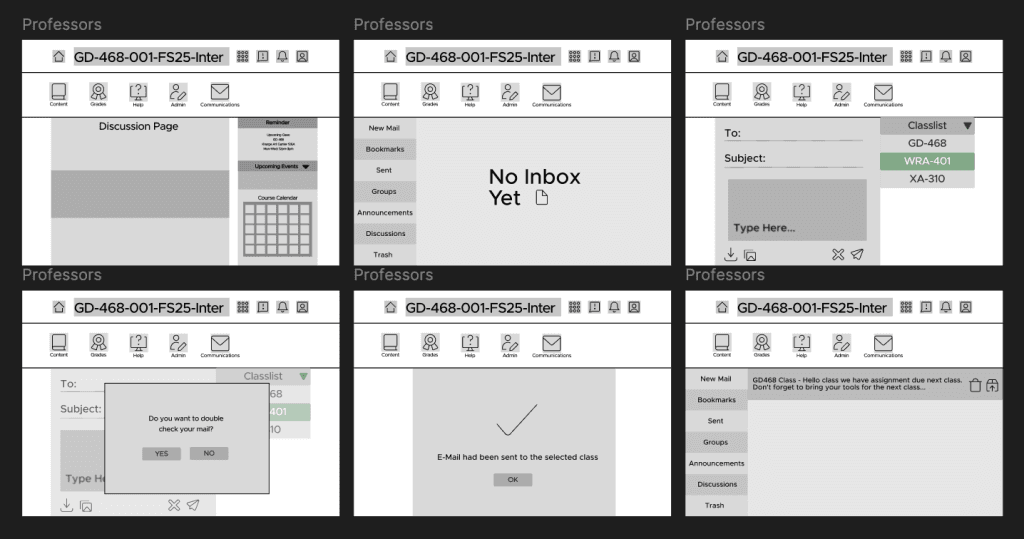
Creating mid-fi wireframes for improving D2L starts with taking rough sketches and turning them into clearer layouts that show how the platform will actually work. These wireframes focus on where things should go on the screen and how students and professors will navigate tasks such as turning in assignments or grading work. By using feedback from real users, the team can test what feels easy to use and what needs to change.
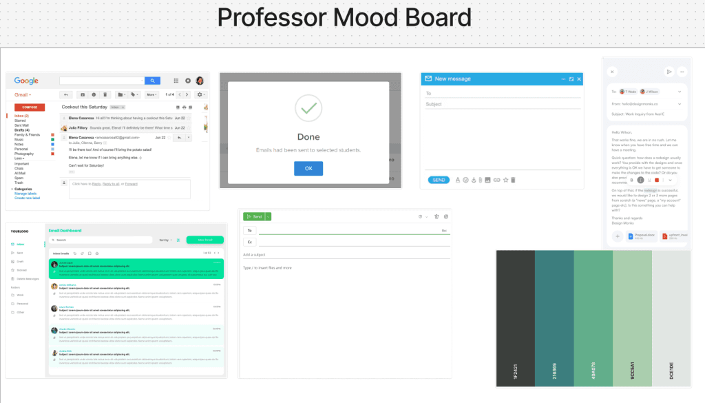
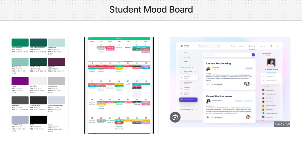
Creating a moodboard for the D2L improvement project helps set the overall tone and style before any detailed design work begins. A moodboard brings together colors, images, fonts, and interface examples that match the kind of experience students and professors should have when using the platform. It gives the team a clear visual direction and helps everyone stay on the same page about the look and feel they’re aiming for. By reviewing and adjusting the mood board early on, the team can build a stronger, more consistent design as the project moves forward.
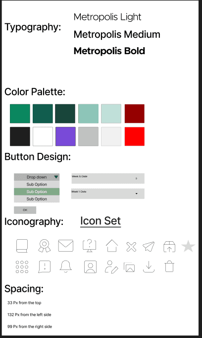
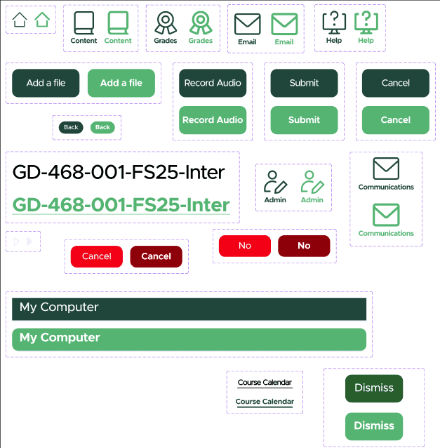
After creating the Mid-Fi wireframes and mood boards, our next step was to start thinking on the style guide. We came together as a group and decided on which design elements we are going to use. Basically, this is the visual “rulebook” that keeps every screen looking consistent design-wise.
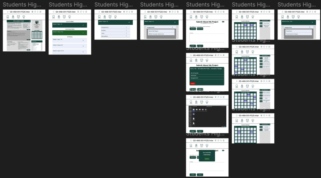
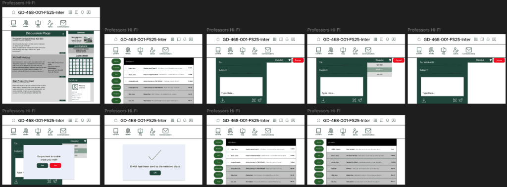
The high-fi designs focus on creating a cleaner, more organized experience. Weekly modules, assignments, and submission screens were streamlined with clear buttons and simple feedback. The course calendar was refined to be more visual and easy to follow. Overall, the high-fi stage brought everything together in a polished, consistent way that’s easier to navigate.
Link to the prototype: https://www.figma.com/design/lEUNn33oOplZ3PHWGcWPN6/Team--4-Wireframes?node-id=67-60&t=Q073RatE8F7VjkJn-0
Link to the Figjam: https://www.figma.com/board/e1NZWfufjhpZ65KiKjVLe1/Team--4?node-id=0-1&t=q4CqQWeJCxjCFkrN-0