Building Event Registration App


Category:
UX Research / UX/UI Design
Client:
Academic Team Project
Duration:
8 Weeks
Project Overview
The Building Event Registration App project focused on designing a mobile experience that helps users discover and register for events taking place within a building. Working in a team of four, we followed a user-centered design process to better understand how users find events, what information they need before attending, and where friction may occur during the registration process. Through user research, surveys, user need statements, concept development, user flows, and iterative prototyping, we developed a mobile app concept that aimed to make event discovery and registration more simple, intuitive, and accessible.
Research Process
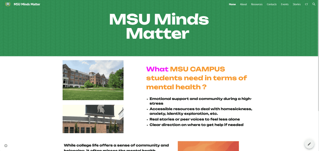
Our research began by exploring how students and community members use shared spaces, what encourages social interaction, and what would make a new community space feel more welcoming and accessible. Through surveys, we gathered feedback around social connection, cultural exchange, accessibility, and the types of activities users would be interested in attending. The findings showed strong interest in inclusive community spaces and highlighted entertainment, music, and social events as opportunities to encourage greater participation.
Based on these insights, we developed user need statements for both the physical space and its digital experience. For the digital component, we identified a need for an accessible way to discover upcoming events, check availability on specific dates, and find the information needed to attend or register. These findings helped shape our concept statement and established the mobile app as a tool for connecting students and community members with events happening within the space.
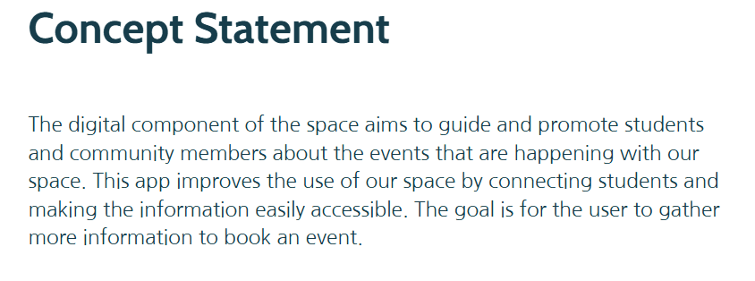
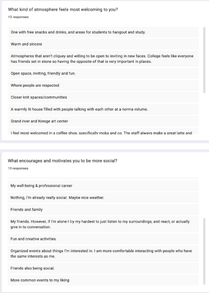
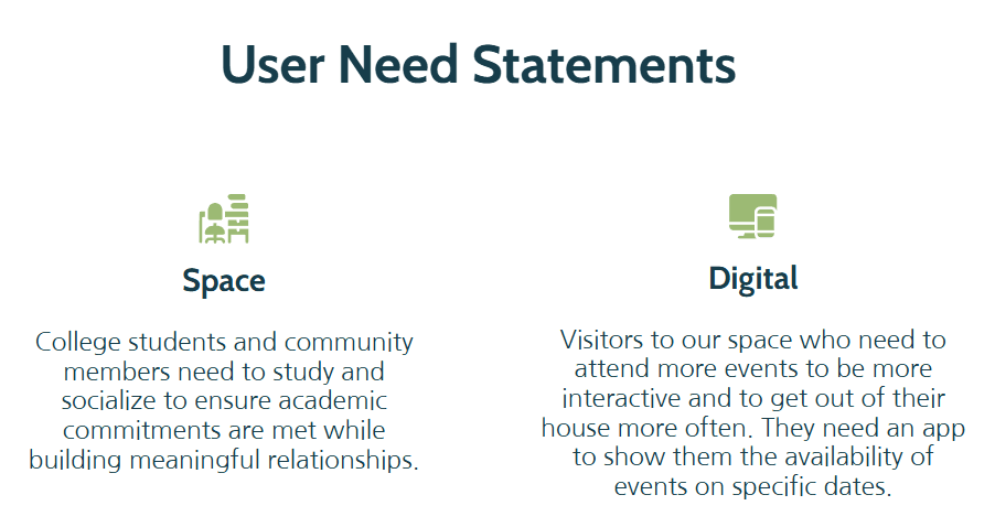
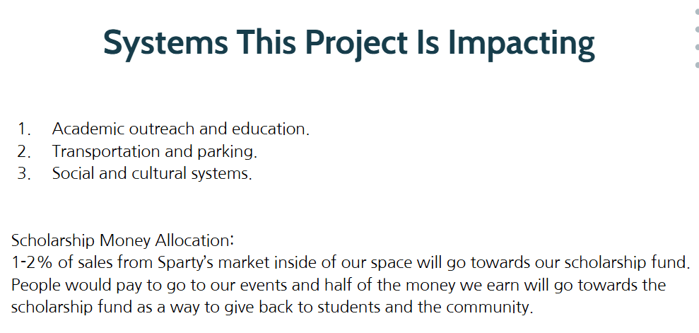
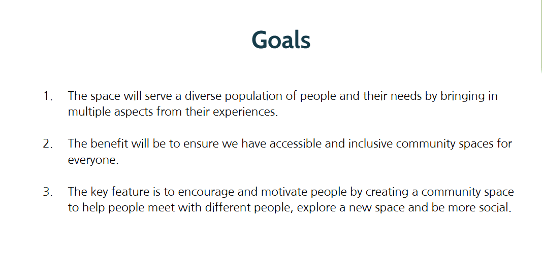
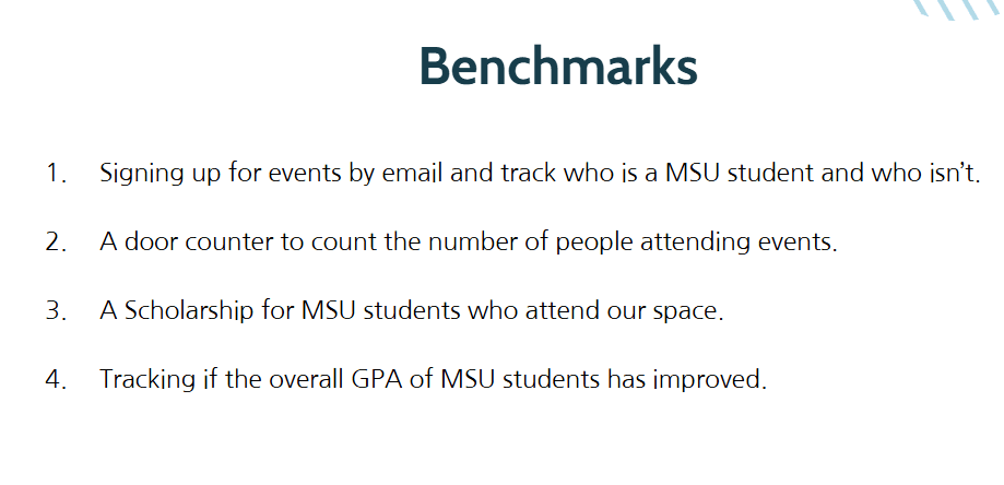
We then translated the research into broader project goals and benchmarks, focusing on accessibility, inclusivity, community engagement, and event participation. These research-driven priorities gave our team a clearer foundation for defining the app experience and moving into concept development and interface design.
Design Development
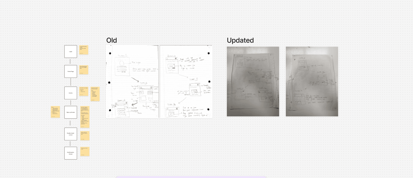
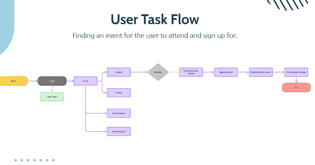
Using the insights gathered during research, we moved into design development by creating a user task flow focused on one of the app’s primary goals: finding an event and signing up for it. We mapped the experience from login and event discovery through viewing event details, completing registration, reviewing information, and receiving confirmation. This helped us define the key steps of the experience and establish a clear structure before moving into interface design.
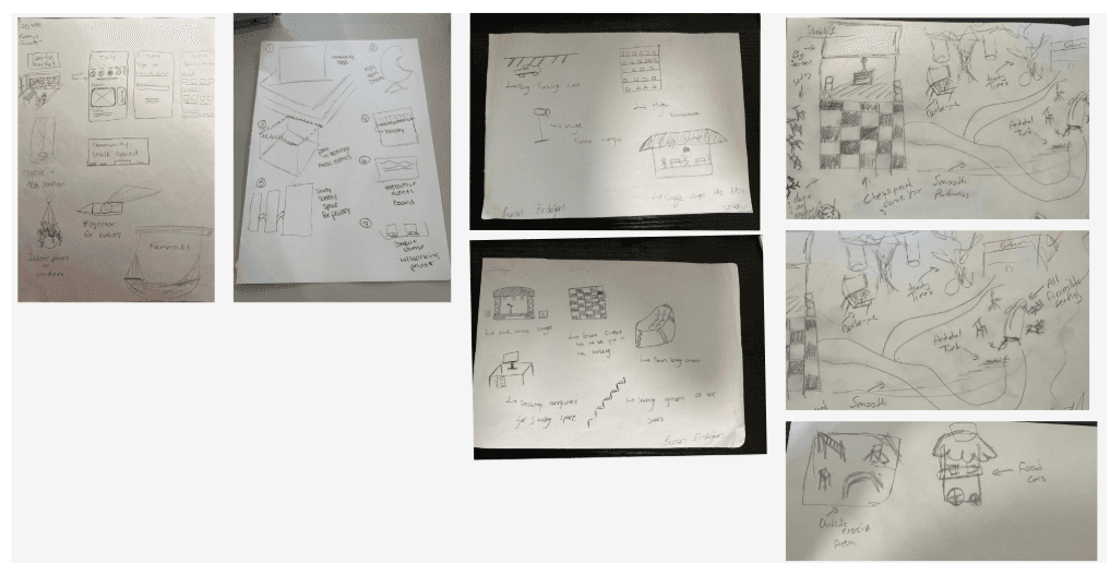
With the task flow established, we moved into low-fidelity sketching as a team. Each team member explored ideas for both the physical community space and the mobile app, allowing us to consider how the two experiences could work together. For the digital experience, we sketched key screens such as login, home, event discovery, event details, registration, and confirmation. At the same time, we explored concepts for the physical space that supported social interaction, accessibility, and community engagement.
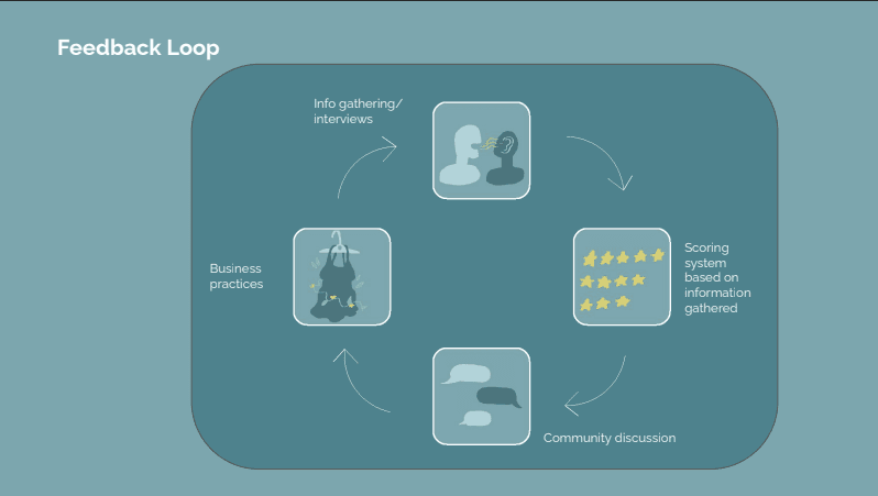
We repeated this process through several rounds of feedback and iteration, refining our sketches two to three times based on the input we received. Each round helped us identify stronger ideas, address usability concerns, and improve the overall direction of both the physical and digital experiences before moving into wireframes.
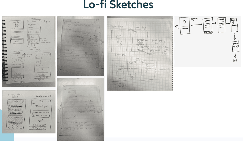
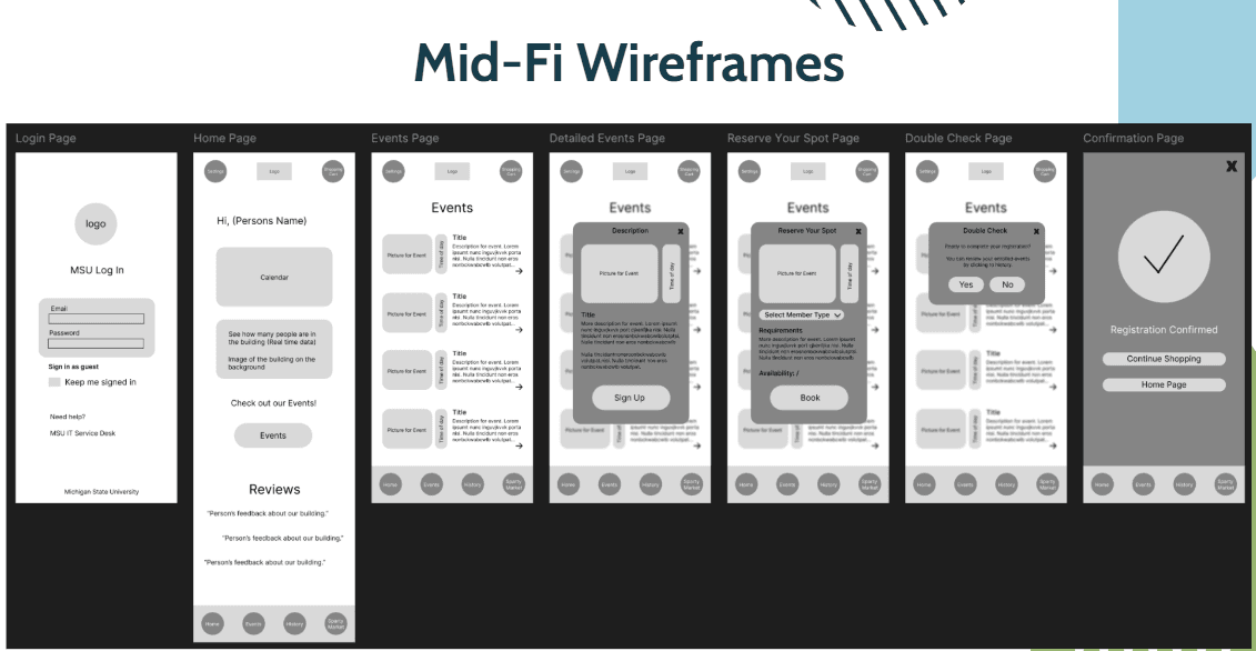
After going through a few rounds of feedback on our low-fidelity sketches, we moved into mid-fidelity wireframes in Figma. At this stage, we focused on organizing the main screens and making sure the flow from finding an event to completing registration was clear and easy to follow.
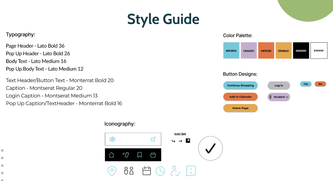
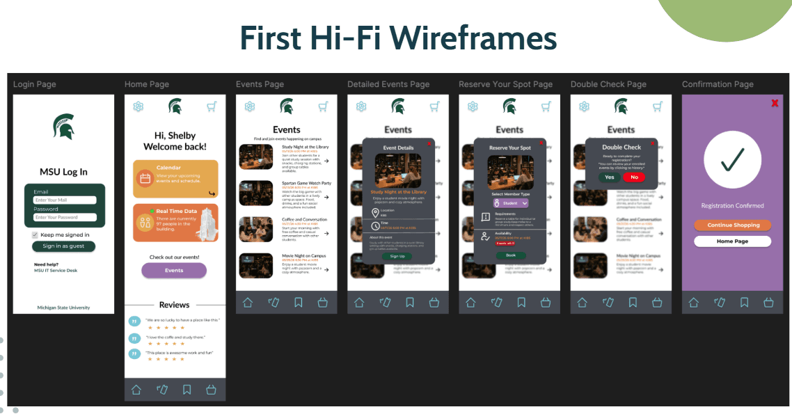
Once we were comfortable with the overall structure, we created a style guide for the app, including colors, typography, buttons, and icons. We used this as a foundation to turn our wireframes into our first high-fidelity designs.
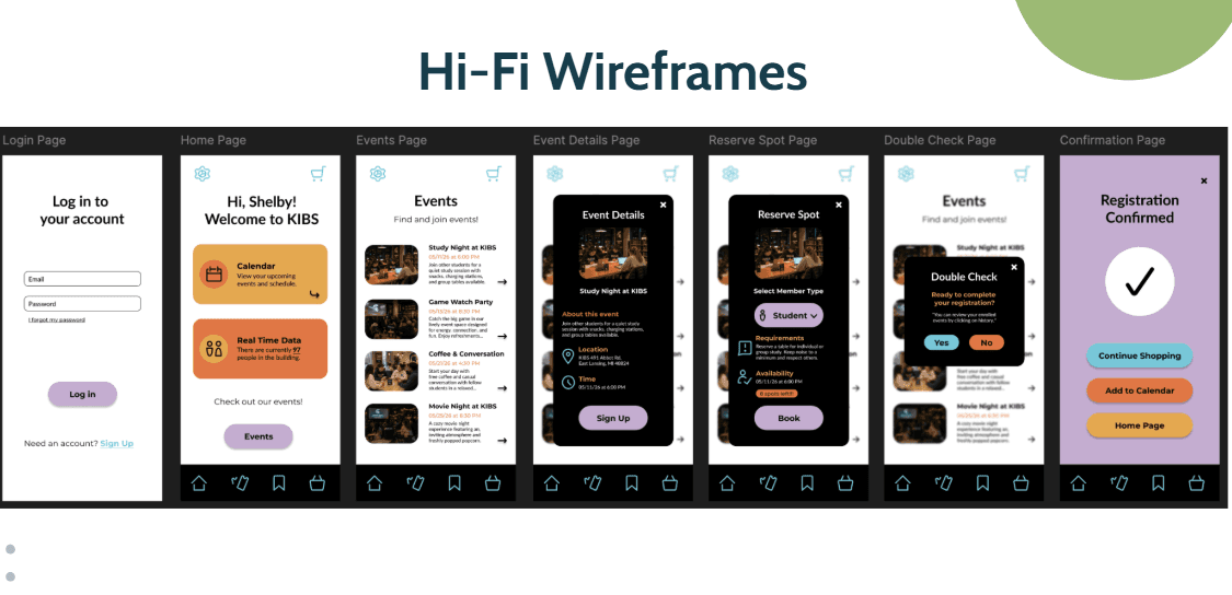
From there, we continued getting feedback and making changes to the interface. We refined the layouts, simplified some of the screens, and made the visual design more consistent across the app. After several iterations, we developed the final high-fidelity wireframes and turned them into an interactive prototype in Figma. This allowed us to connect the screens and demonstrate the full experience, from discovering an event to completing the registration process.
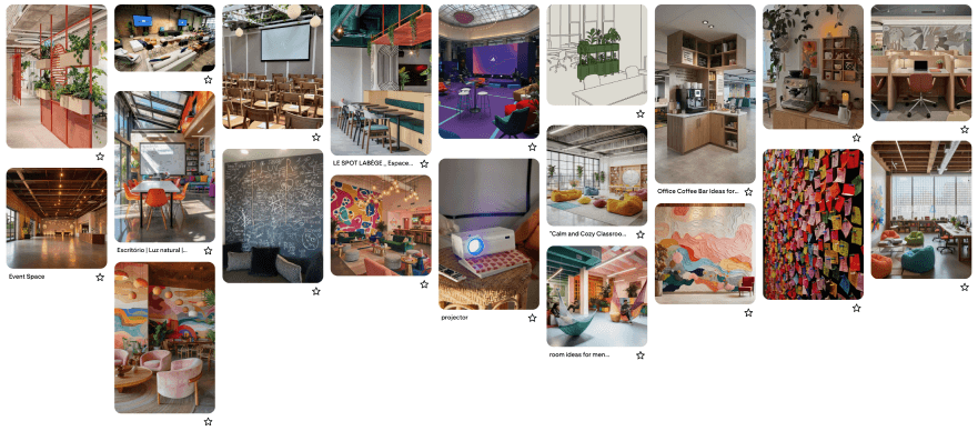
For the physical space, we created a mood board to capture the overall look and feeling we imagined for the environment. We explored references for flexible seating, social areas, study spaces, event spaces, and creative elements that could make the space feel more welcoming and engaging. Since our main focus for this project was the mobile app, we used the mood board to communicate our vision for the physical space while spending most of our design time developing and refining the digital experience.
Reflection
This project helped me better understand how research, feedback, and iteration can shape a design from an early idea into a complete experience. Working in a team of four also gave me experience sharing ideas, comparing different approaches, and making design decisions together throughout the process.
One of my biggest takeaways was the importance of not jumping straight into high-fidelity design. Starting with user needs, task flows, and low-fidelity sketches gave us a stronger foundation, while multiple rounds of feedback helped us improve the experience along the way. Overall, the project strengthened my skills in UX research, user flows, wireframing, prototyping, and visual design, while showing me how each stage of the design process connects to the next.